MSU Broad Art Museum Bingo
Background:

One of the projects worked on in my interaction design class was a bingo design project. The project tasked us with creating our own unique approach to the beloved game of bingo. The project was designed to better familiarize us with the steps in the design process, as well as strengthen our skills creating wireframes, mockups and prototypes. This class is largely responsible for my familiarity with Figma.
Role:
Ideator
Lead designer
UX Researcher
Interaction Designer
UI Designer
Animator/Prototyper
Design Strategist
Approach:

For this project I began by creating a concept statement. My idea was for a museum based bingo board that would help shake up the traditional museum experience. The app would encourage users to go and find artwork based on different categories like “Sculptures”, “Surrealist paintings” “Self Portrait". Players would be able to upload pictures of the art for verification and in turn win discounts and earn prizes.

I then began working on the User Needs Statement, Which allows me to identify the problems I'm hoping to solve with the app. This app was created under the belief that after a while, the typical museum experience can begin to feel repetitive. Museum-goers are looking for new ways to spice up their visits and make the experience more engaging. This app was created to transform the traditional museum experience into a more interactive, gamified experience that rewards frequent visitors.My User Task Flow was straight forward. Users will; open the bingo app, go through the categories to select a bingo board, begin scavenging for art, verify their findings by uploading pictures and receive awards, earn points and win prizes.


Once My user Task Flow was completed I decided it was time to do a little more research. I decided to try to create an app that was designed to work with the MSU Broad Art Museum. I wanted the app to work well paired with the museum experience, and so I went to the in person to conduct some research on the exhibits. This research helped inform some of my design choices in content and aesthetics. I decided to open the board categories up to other forms of art that I had not considered prior and also decided to lean into an elegant, simple aesthetic and vibe for the app. With this in mind I began completing sketches of potential app screens.
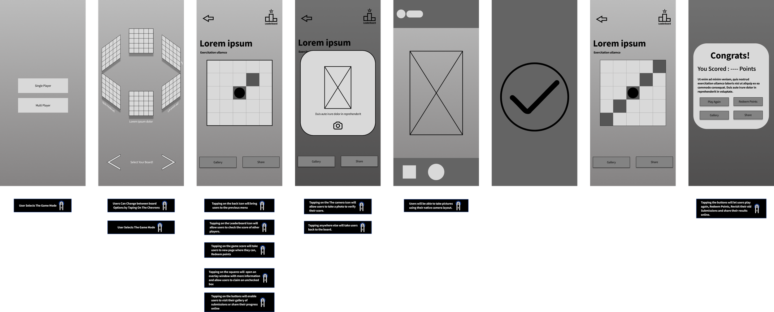
After finalizing the look and order of the screens, I began wireframing the app in black and white. Working in grayscale allows me to reduce the cognitive load by eliminating the distraction of colors and stylistic elements which allows me to better focus on details like structure, functionality and user flow. This approach also helps me better consider the placement and hierarchy of content, ensuring that every element serves a clear purpose within the design. One of the most important design principles I follow are the “C.R.A.P” Principles which are contrast, repetition, alignment, and proximity. Together these Its at this stage that I also include gesture statements, so others get a clear understanding of how users will interact with the app and trigger functionality.
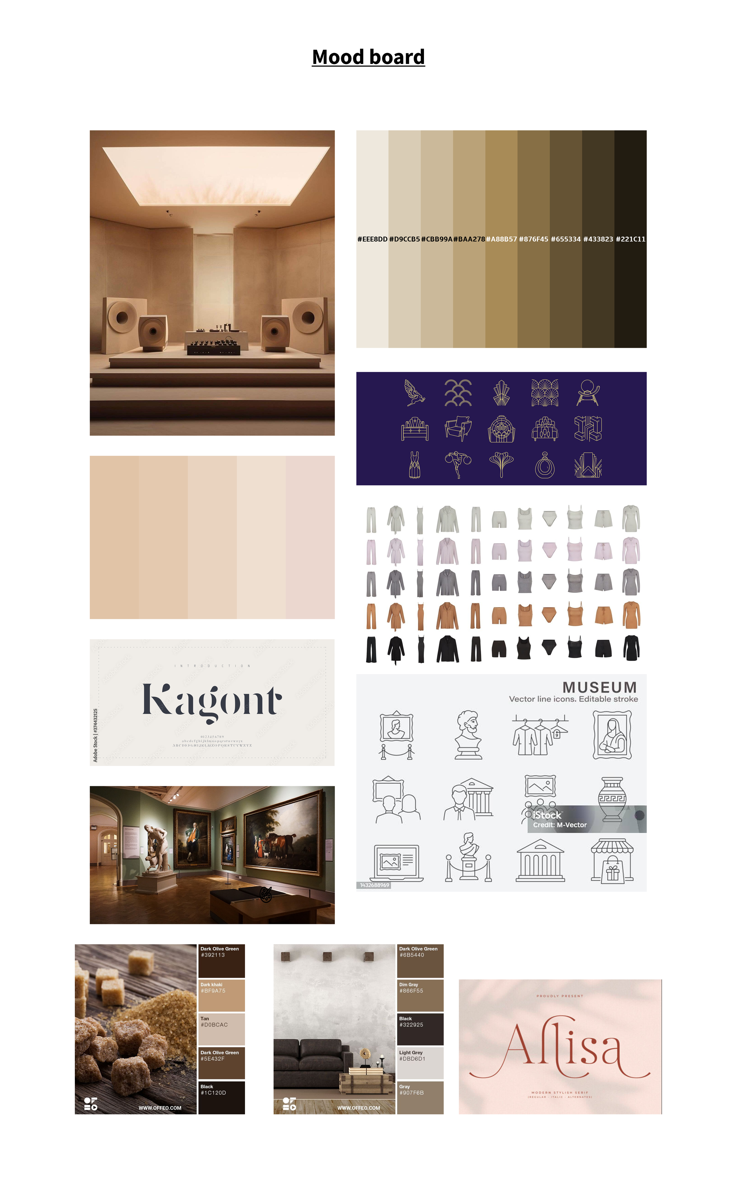
I then made a mood board to help establish the overall look and feel I wanted the project to have. I spent some time online looking at and compiling a bunch of images, fonts, colors, products etc that represent the tone and direction I wanted to take with this project. I was primarily inspired by natural tones, earth tones, minimalism, simple but forward in vibe. This process helped me settle on some of the finer details like iconography styles, font, background color.

Once the mood board was complete and I had settled on the artistic direction for the project I began developing a high-fidelity wireframe. I decided to go with the Sriracha font and used a light-brownish linear gradient for the background. As a way of bringing in some contrast I styled the buttons with a darker brown color. I then searched online and compiled a cohesive list of icons that best represent the categories on the boards and work aesthetically with the rest of the elements.
The final part of wireframing was the animating / interaction design portion. For this project I animated a carousel style board selection, loading screens, drop down cards, bingo board squares getting checked off and a faux picture taking on the iphone.
Results:
The outcome of my MSU Broad Art Museum Bingo project was a fully realized high fidelity prototype of a bingo companion app made to improve museum engagement by bringing a gamified experience that encourages users to explore museum exhibits in new and meaningful ways. The project not only resulted in a prototype and poster, but also helped advance my skills in interface design, interaction design and animation, as well as practice leading projects from concept development to visual execution, allowing me to practice following the full design thinking process, which is to empathize, define, ideate, conduct user research, wire frame, mood boarding, prototyping and animating. Overall the project was a valuable learning experience that I believe shows my ability to lead design initiatives from start to finish and not only design static screens but bring them to life with interactive elements as well.